Save time by creating a personal library of custom components like the iOS and Android component layers built into Origami Studio.
In this tutorial we’ll create a Document component, manage component properties and add it to the Layer Library. We’ll cover sharing components in the Create a System tutorial.
Download the tutorial start file to follow along as we rebuild this prototype.
Creating a Component
Let’s begin by converting the Toggle Button Group into a Document Component. Select the patches in the patch graph (minus Default Glyph and Active Glyph), then hold down the Command key and select the Toggle Button Group layer in the layer list, right click and select Group Into Component from the menu.
A dropdown interface will appear, here type in the name of the component. Let’s name the component Toggle Button.
We have now created a Document component.
Creating Inputs
Document components can contain both layers and patches, these patches can control layer properties. We can control properties from outside of a component, like the ones already displayed in the layer inspector. This is called publishing a port.
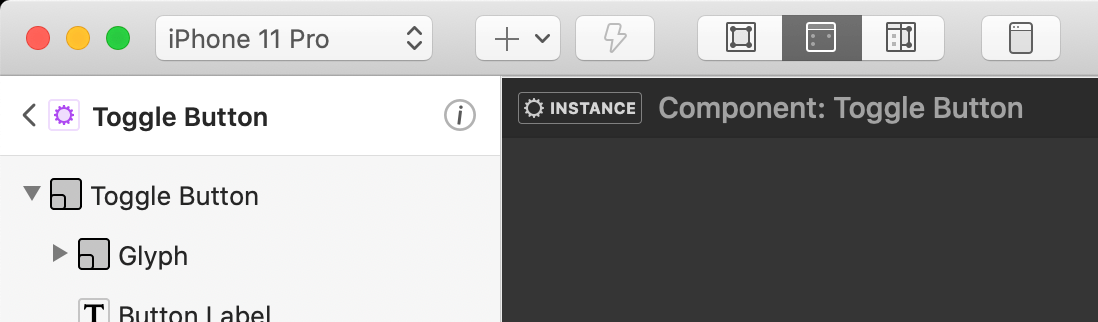
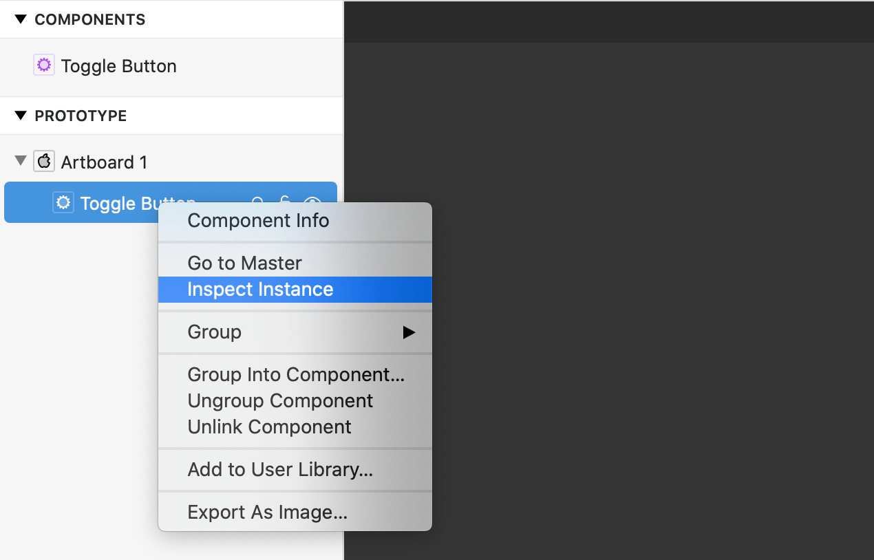
One way to create an input port is from within the component. Enter the component by selecting the component in the layer list and double clicking on the component’s icon, or right clicking and selecting Inspect Instance from the menu.
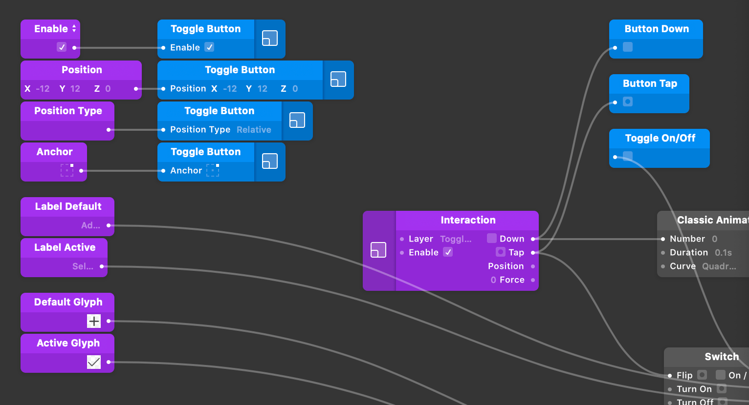
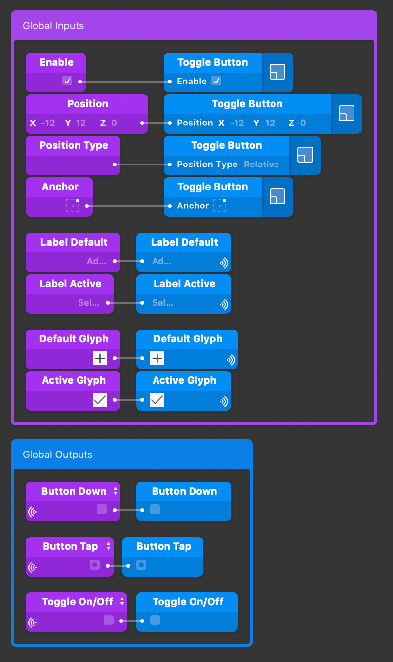
When a component is created, it’s contained within a Group. Here you’ll also notice some commonly used input ports (Enable, Position and Anchor) have been already published and linked to this container Group.
Publishing ports
Now we’re going to publish some other layer properties along side these, allowing us to customize this Toggle Button from it parent level.
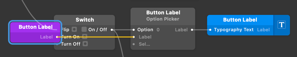
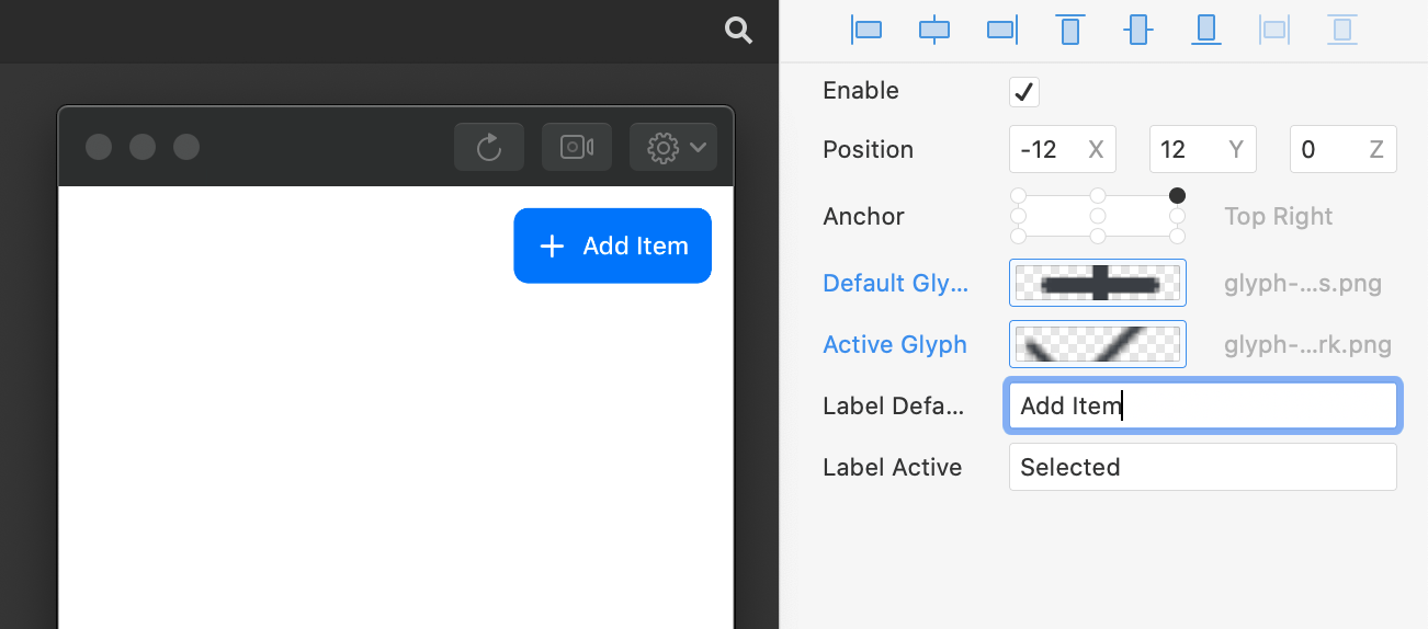
Inside the component’s patch graph select the second input port of the patch labelled “Button Label”.
Next, click Component in the top menu and select Publish Port ⌥P.
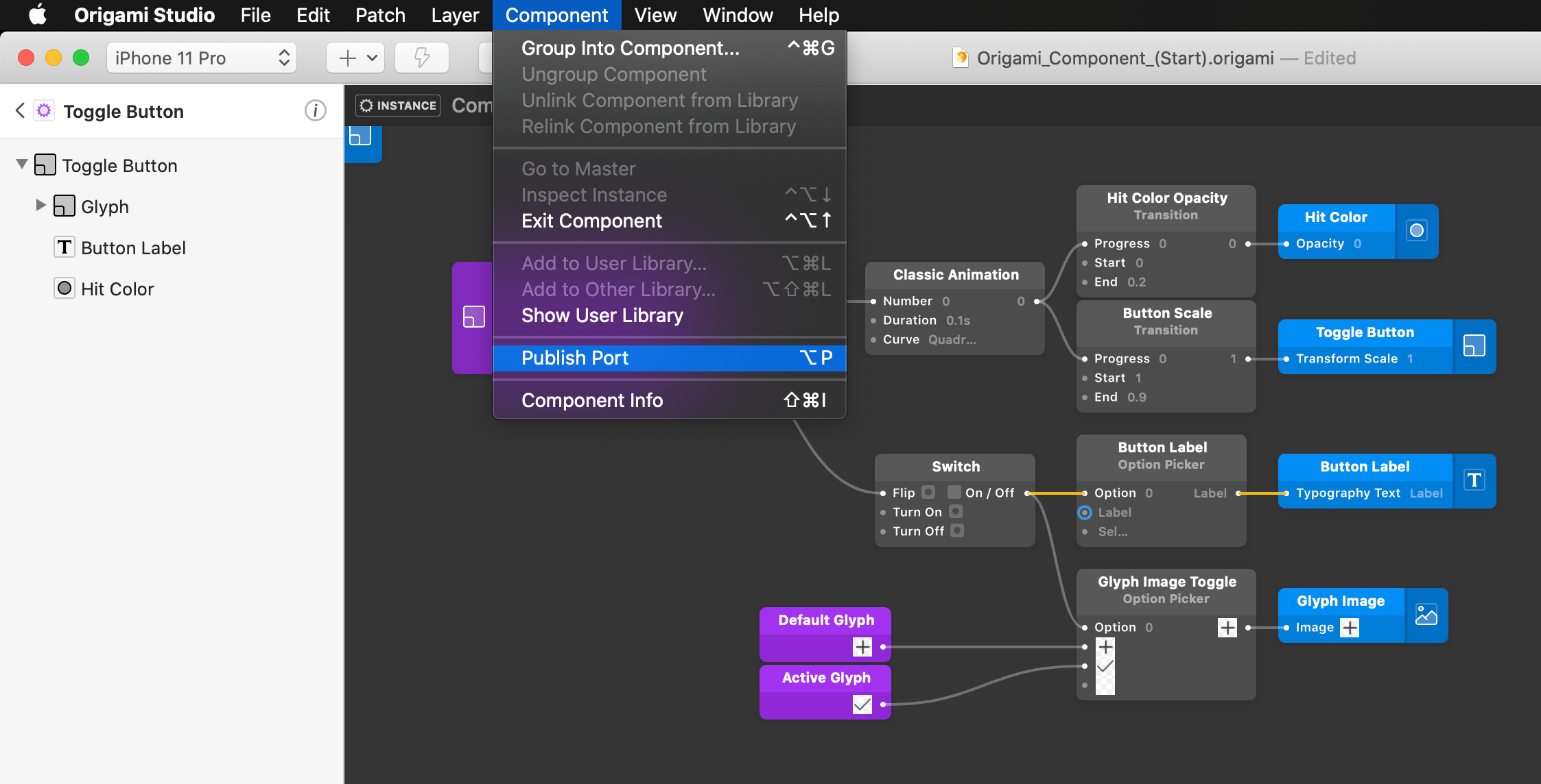
A purple provider patch has been added to the Patch Editor and named after the patch label, which in this case is Button Label. Let’s rename this patch it to make it clearer what this image will be used for. Select the published patch and use the ⇧⏎ key to rename, clear the text and type Label Default.
Repeat the step for the third input and rename the published port to Label Active.
Now let’s exit the component to see the renamed ports displayed on the parent level. Exiting will navigate us back up through the document, do this by clicking on the menu icon in the breadcrumb navigation in the top left of the layer list, or using the shortcut ⌥↑.
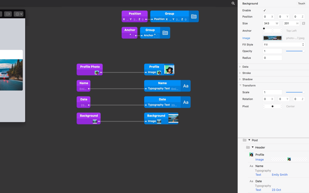
Now we’re at the parent level, we can select the Toggle Button component in the layer list where we’ll see our Profile Photo input that has now been published on the Layer Inspector.
Publishing other layer properties
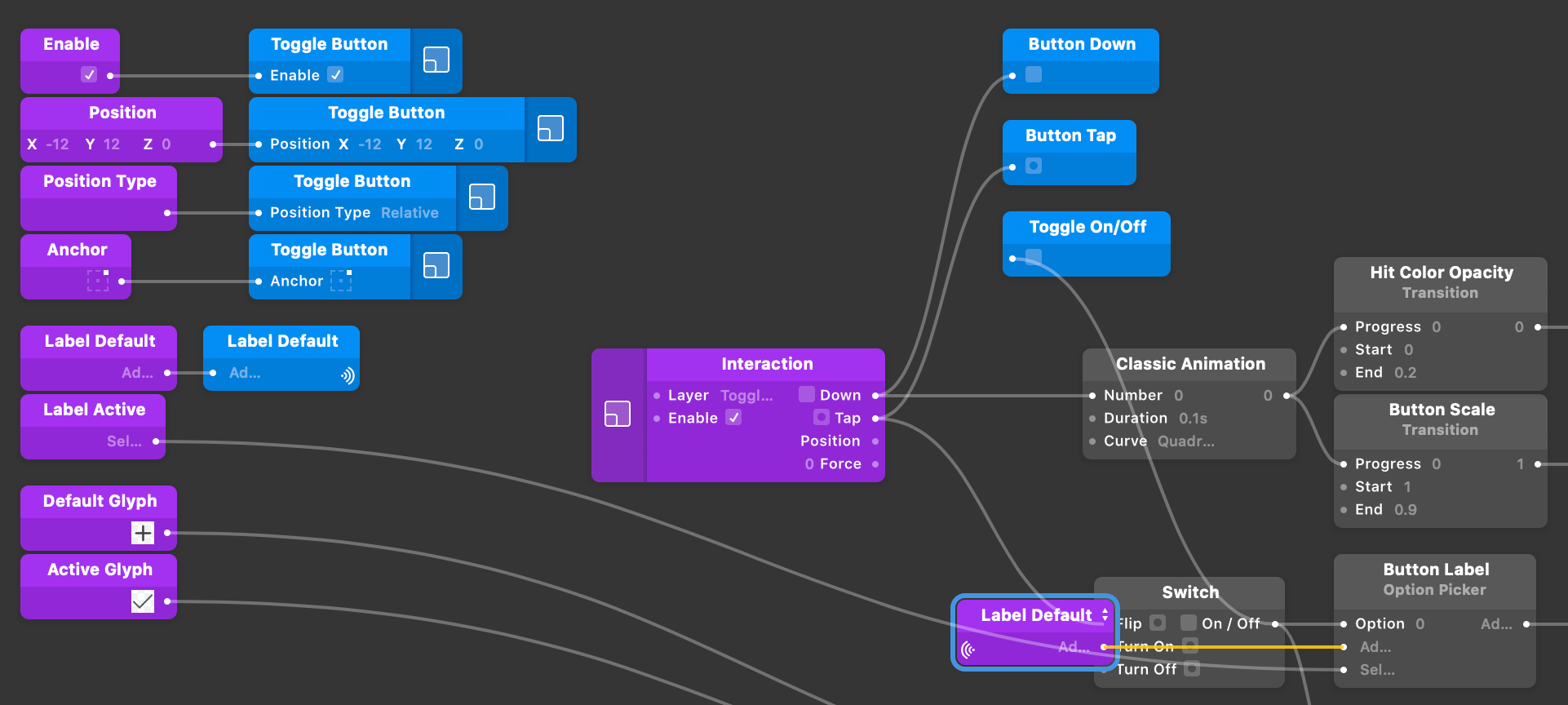
Let’s re-enter the component and publish a few more properties. Repeat the process of publishing a layer property for the Name and Date text layers, then and the Background Image layer.
Rename the published ports to Name, Date and Background.
Modifying Component Properties
Select the Toggle Button component, the ports we just published, Label Default and Label Active are displayed in the layer inspector as editable properties. Try editing one by typing in “Add Item” into the Label Default and seeing the component update in the Viewer.
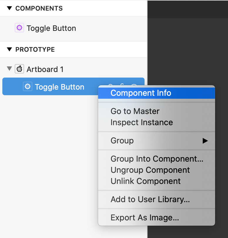
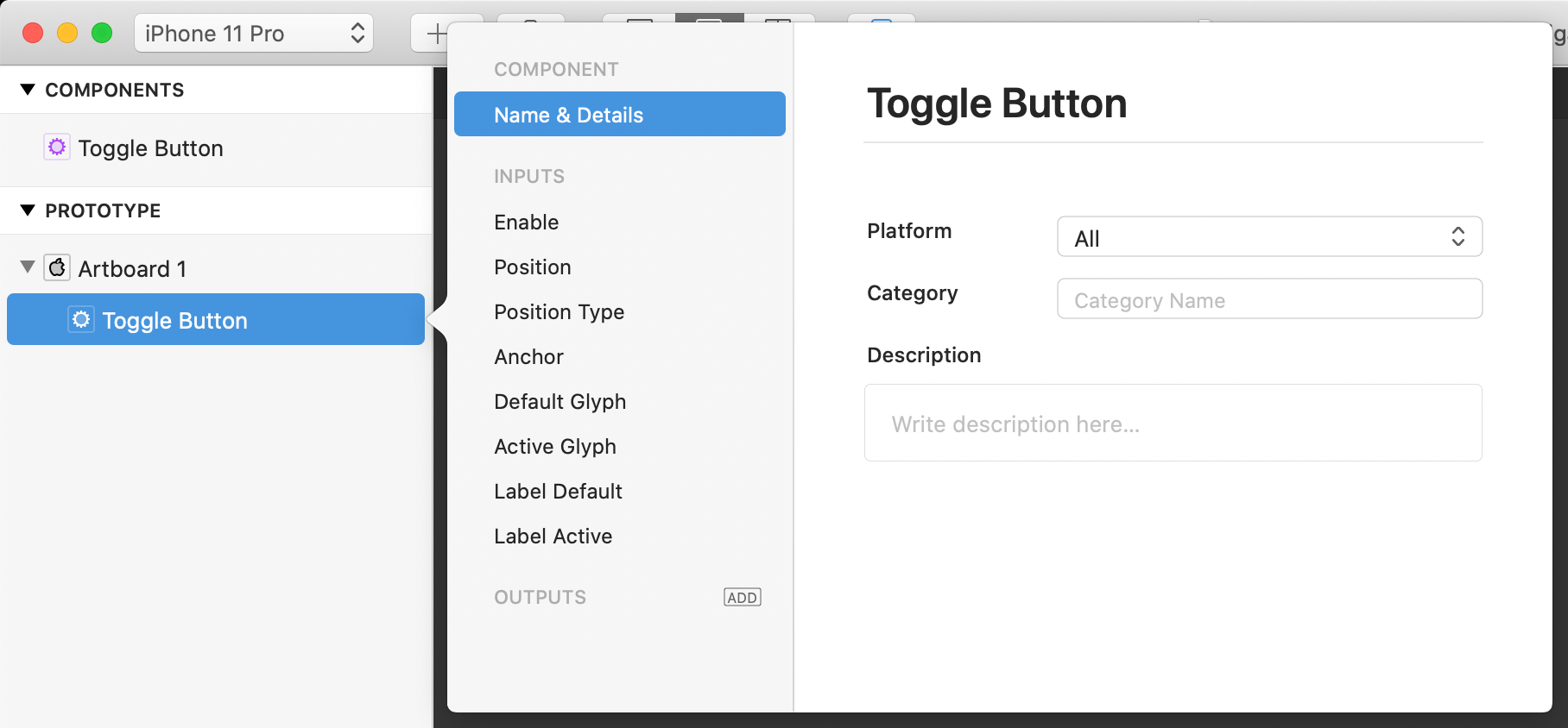
We can modify the Component’s port details via the Component Info popover. To open the popover, right click on the component in the layer list and select Component Info from the menu or use the keyboard shortcut ⇧⌘I.
You’ll see all the inputs and outputs for this component are listed on the left hand side. From here we can add and remove ports, rename them, change their type and organize them into categories on the layer inspector. Let’s create some categories for the items in the layer inspector. First select Glyph Default from the list in the Component Info window.
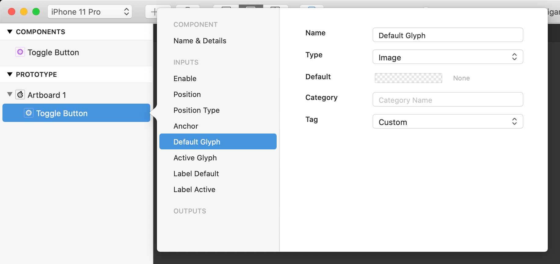
Rename the port to Default and in the Category field type in Glyph. Do the same thing for the Active Glyph port by renaming it to Active and type Glyph into the Category field. Next do a similar procedure with the Label Default and Label Active ports and
We can also rearrange the ports. Let’s put the Profile Photo port at the bottom of the header category. Do this by clicking and dragging the Profile Photo port below the Name and Date ports.
Adding Outputs
We’re going to add a few outputs in order to track the interactions of our Toggle Button. With the Component Inspector still open, Navigate down to Outputs and mouseover the label; the word Add should appear.
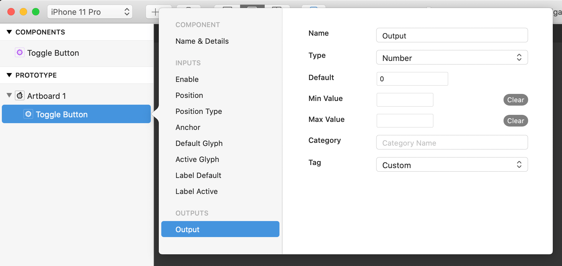
Click on it and a new Output port will now be visible in the Component Inspector.

Add two more Output ports before continuing on. Rename the first port to Button Down and change type to Boolean, the tag should be automatically set to Custom.
The Type property is set to Number by default. This determines the input or output type in the layer inspector and the format of the data passed into the component. The other input types were set automatically when we published the inputs, for example Default Glyph was set to Type: Image and Label Default was set to Type: Text.
The second port should be renamed to Button Tap and change the Type to Pulse. Last, rename the final Output to Toggle On/Off and change the Type to Boolean.
Connecting a new input/output to layer or patch properties
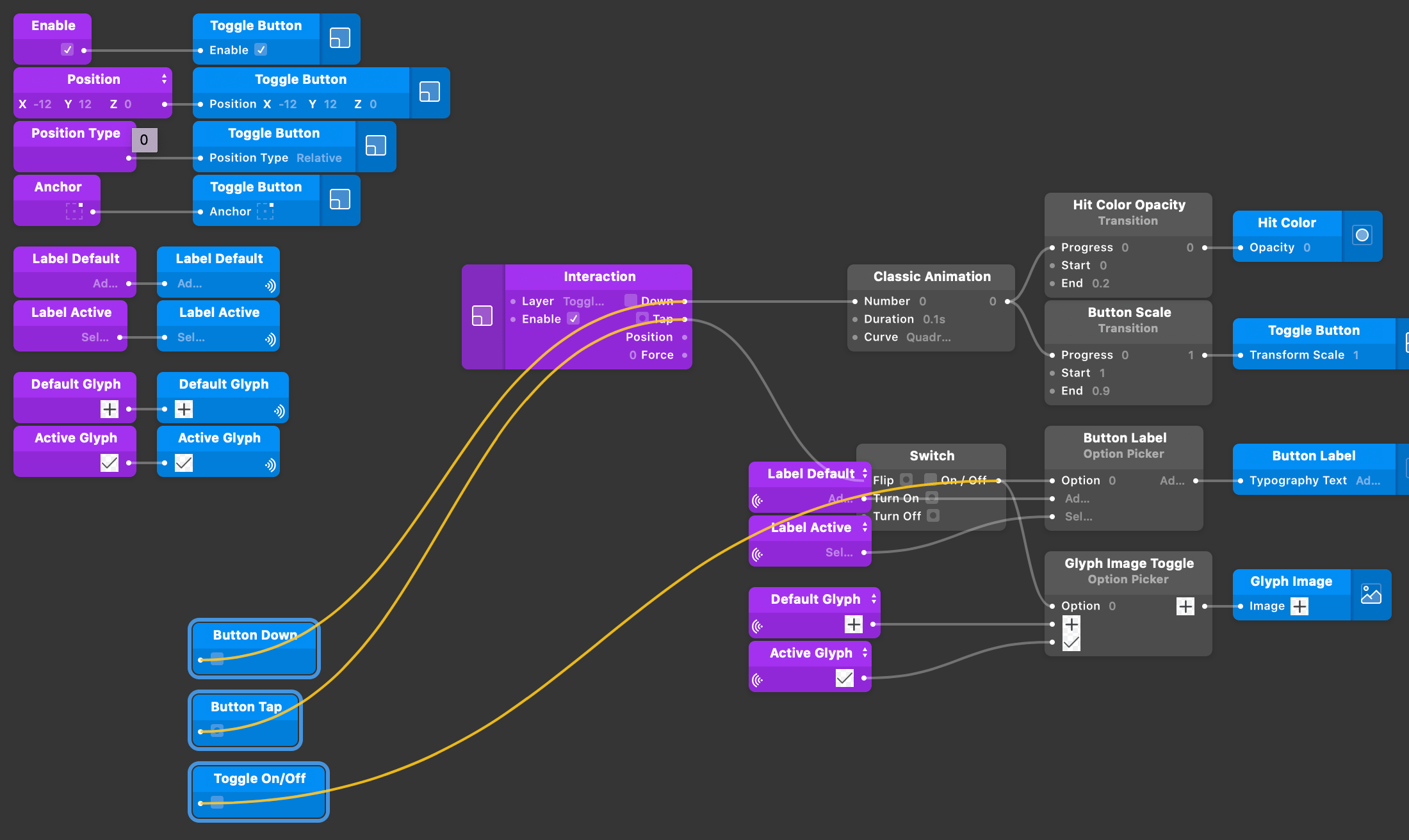
Now we need to go inside of the component and link the three new outputs. Re-enter the component by right clicking on it in the layer list and selecting Inspect Instance.
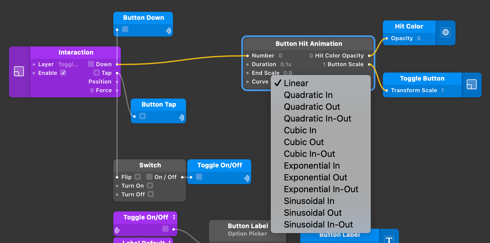
There is now three new published output patch inside the component, with the assigned names. Let’s connect these outputs in order to capture the button’s actions and its current state.
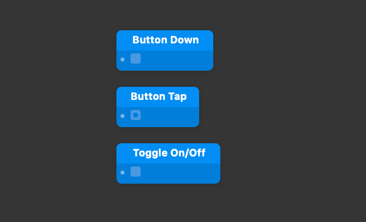
Select the Interaction patch and connect the Down output to the input of the Button Down patch.
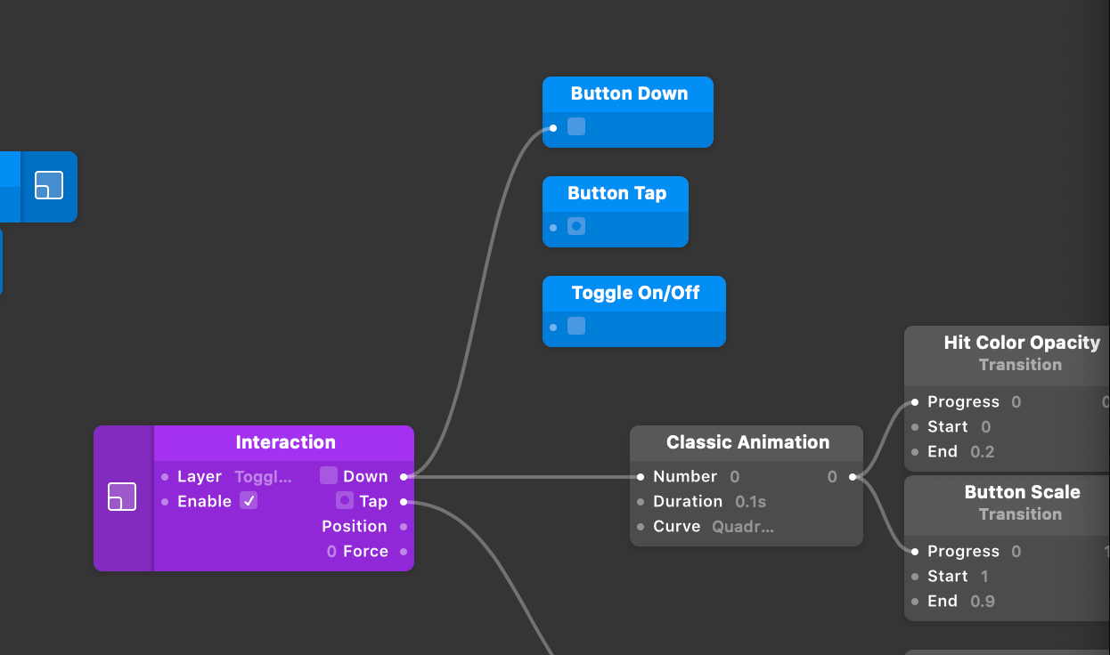
Proceed to do the same for the Button Tap patch by attaching the Tap output from the Interaction patch. Last, connect the Switch patch to the Toggle On/Off patch.

Organizing Components
Once we’re finished with our component, we should organize the patches within the patch graph. Having a clean and organized patch graph will make maintaining the component much easier should you want to make and modifications to your component(s). Let’s start by gathering all of the component inputs into one area of the patch graph.
Next we’ll create wireless broadcasters and receivers for the bottom for inputs. Select the output of the Label Default patch and hit ⌥P. This will create a wireless broadcaster and it will automatically inherit the name of its source. Next, go to the Button Label option picker. Select the second input port and hit ⌥shiftW on your keyboard. A new wireless receiver will appear with a matching name of the broadcaster.
Repeat the steps with the last three input ports. Once you’ve finished, your patch graph should look similar to this.

Next, we’ll organize our component output patches. Select the three output patches and move them below the input patches.
Now we’ll create additional wireless broadcasters and receivers. Select the Down output port of the Interaction patch and hit ⌥W on your keyboard. Rename the broadcaster to Button Down. Select the input port of the Button Down patch and hit ⌥shiftW on your keyboard to create the corresponding wireless receiver.

We’ll repeat the steps for the Tap output of the Interaction patch and name the wireless broadcaster to Button Tap. For the final broadcaster/receiver, we’ll select the output of the Switch patch. Hit ⌥P on your keyboard and rename it to Toggle On/Off. Finish by creating the Wireless Receiver to the Toggle On/Off output patch.
We can now further organize the patches by grouping them into a Comment patch. Select all of the component input patches, then hit ⌃⌥W. A new Comment patch should appear and encapsulate all of the selected component input patches.
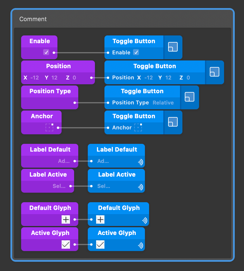
Rename the Comment patch to Global inputs and then right-click on the patch to change the color. Change the color to Purple since this is the source of the Inputs for the component. We’ll do the same process for the outputs only this time changing the title to Global Outputs and changing the color to blue.
A useful feature of the Comment patch is if you want to move all of the patches that reside within the Comment patch, all you need to do is select the Comment patch itself and move that. All of the patches within will move along with the Comment patch.
Building Patch Components
Along with layer components, you can also create patch components within Origami. Patch components are timesavers if there is a set behavior/function that you would use often and you don’t want to constantly replicate a patch network. Let’s start by building a patch component within our layer component. From within the component, select the Classic Animation patch, Hit Color Opacity, and Button Scale. Right-click on one of the selected patches and select Group Into Component.

Name the new patch component Button Hit Animation. The new patch component has been created; now let’s make some edits to the component. The fastest way to make the changes will be to enter the patch component. Double-clicking on the component will take you directly inside of the component.
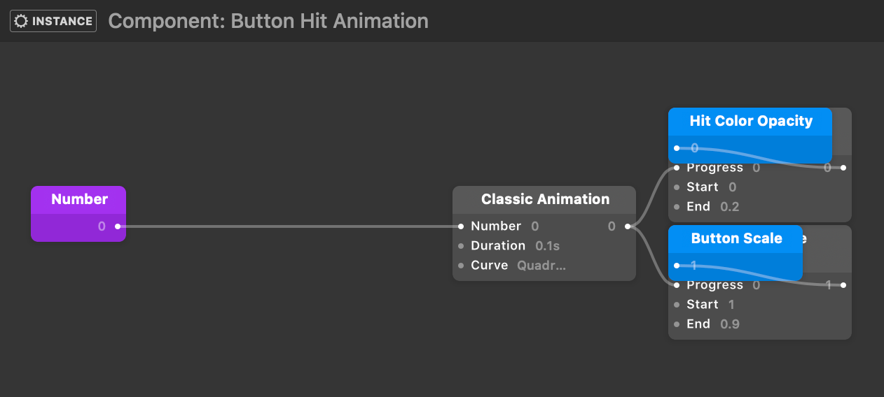
The patches may have some overlap inside of the component, so take a few moments to organize the patches. The first patch input we’ll want to add is for Duration. Select the input port for Duration in the Classic Animation patch and hit ⌥P on your keyboard and leave the default name that it’s been given. Next, select the End input port of the Button Scale Transition patch and again hit ⌥P on your keyboard, but this time rename the Input patch to End Scale.
The last Input port we’ll want to add is for the animation curve. Select the input for Curve in the Classic Animation patch and hit ⌥P on your keyboard. This will automatically create an Enum datatype for the input and generate a list of selectable animation types from the top level of the patch component.
Reusing Components
Once we’re finished with our component, we can exit back out of the component. Both the layer component and patch component have automatically been added to the document library. To have the components accessible within another file or a new file, you will need to add the component(s) to your User Library.
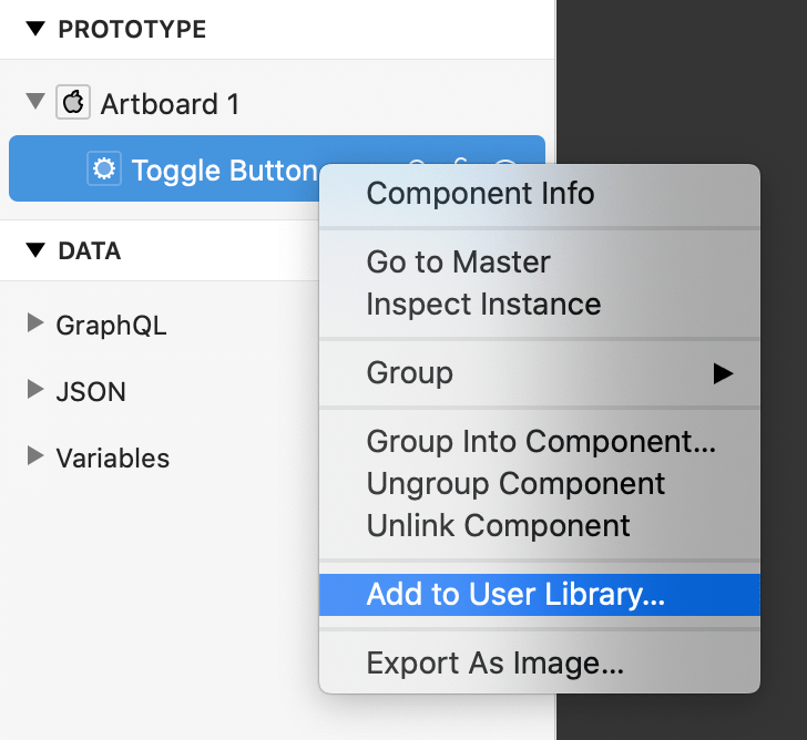
Adding a component to the User Library is very simple. All you have to do is select the layer component or patch component and right-click. From the pop-up menu, select Add to User Library.
To add the component in a new document, start a new document by selecting File and clicking New.
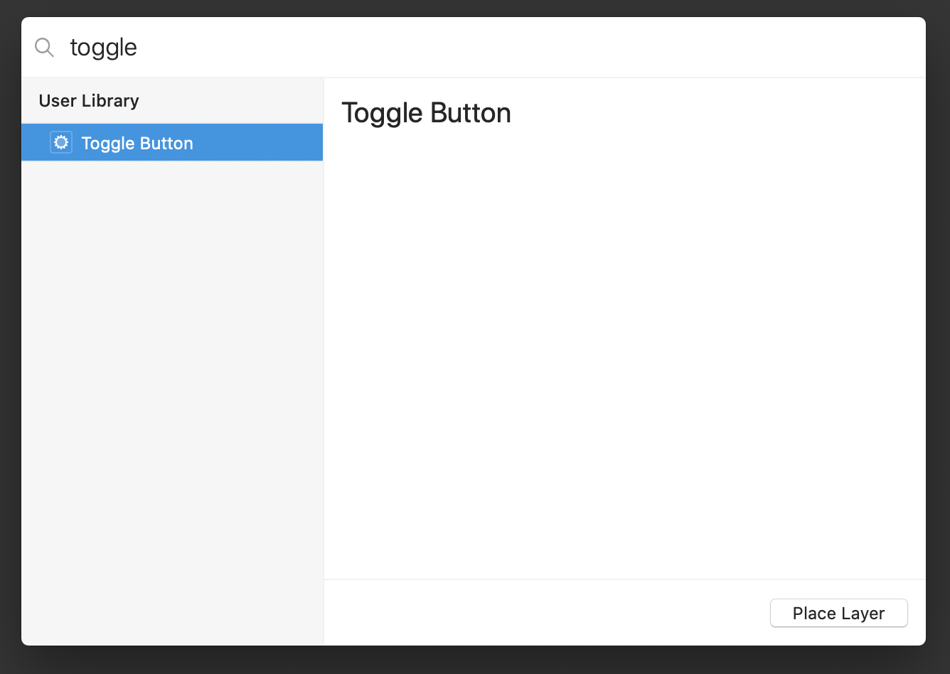
To add the component from the Layer Library to our new document, click the + icon in the top right of the window to open the Layer Library and type Toggle to search for the component we just added. Press Enter to place an instance of this component into the document.
Wrapping Up
Document and patch components are just one example of components you can create in Origami.
If you’re looking for ways to share layer and patch components with others, there’s more information on the Components page or learn how to Create a System.