Use two Text Field components to build a prototype where you can enter information to sign up for a speculative Origami Studio newsletter. Once all of the information has been entered we’ll reuse it to display a personalized confirmation screen.
We’ll walkthrough the Text Field component by showing how to customize it’s appearance, how use the component outputs, and how to display a Fake Keyboard to simulate a native keyboard in Origami Studio.
Download the tutorial start files to follow along as we rebuild this prototype.
Using a Text Field
The Text Field component allows Origami to capture text input. As you interact with this component, you’ll be able to use your computer’s keyboard to input text. When connected or exported to Origami Live, you can also use the device’s native keyboard.
Adding the Text Field component
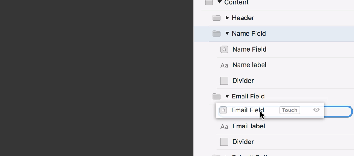
The starting tutorial files have two Screen layers with assets in place. To start we’re going to concentrate on the Register Screen. Inside this screen component there are groups for the header, the form content, which contains a group for each Text Field, and the submit button. We want to place a Text Field component in both of the text field groups.
To insert a Text Field component, open the Layer Library by pressing the + icon in the toolbar. Type to find the Text Field component and click Place Layer to add it to the layer list.
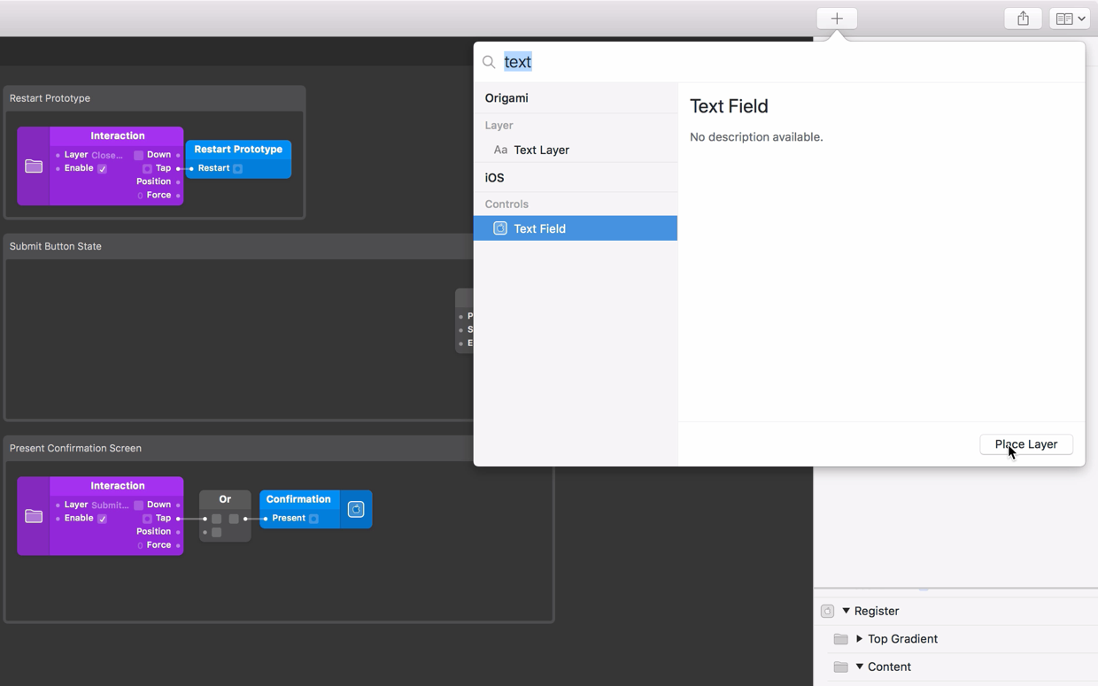
Drag the Text Field layer down the layer list into the Register Screen, then inside of the Content group and finally inside the the Name Field group.
Adjusting the Text Field
Now let’s change the appearance of the Text Field by adjusting the properties in the layer inspector to fit the design.
To start we want the Text Field to be left aligned and inset to the right so that it’s not overlapping the adjacent Text layer.
Select the Text Field layer in the layer list and change the Anchor property in the Layer Inspector to Center Left. Next set the X input property to 72.
In order to make sure the Text Field doesn’t go over the edge of the screen, we need to reduce the width of the Text Field. Our container group is 322 wide, but our component has an X position of 72, so the Text Field should be 72 narrower than the group. Set the Width value to 250.
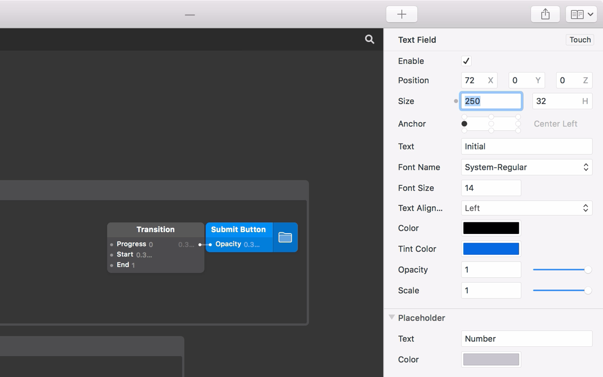
Next, let’s setup the text properties. Set the text size to 18, then set the Color by using the color picker to select the darker blue color from the Origami logo.
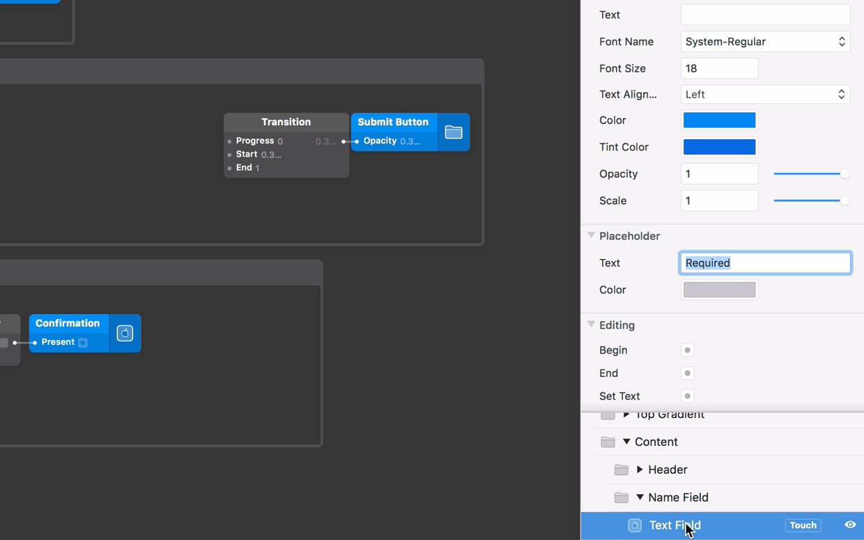
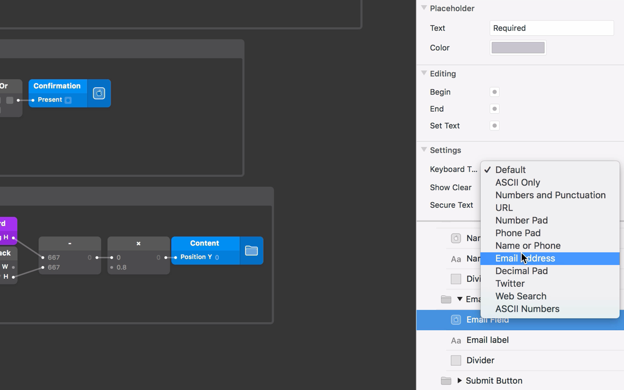
Placeholder text guides a user to enter the correct information. Once text is entered, this placeholder message will disappear. To view the Placeholder, we need to clear the Text Input property – select the Initial Text input and remove the content. To set the placeholder text, look for the Placeholder Text input further down the inspector, set it to required.
Creating the second Text Field
The first Text Field is ready to use, lets rename the layer to Name Field so later we can identify it’s inputs and outputs in the patch editor. To do this, double click on the layer’s name, type Name Field and press Return.
Now lets do the same for an Email Text Field, select the Name Field component then copy and paste. Rename this copy to Email Field and move it into the the Email Field group.
Handling Text Entry
Adding the keyboard
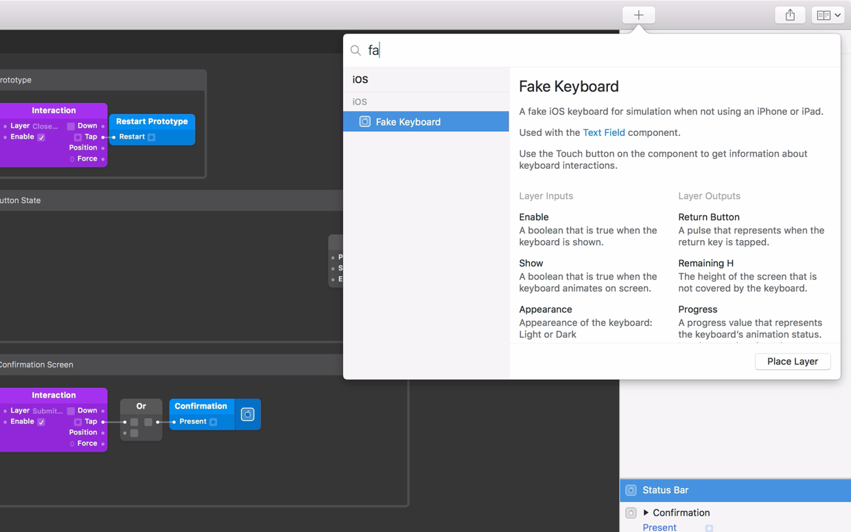
Let’s add a Fake Keyboard component from the Layer Library.
The Fake Keyboard component in Origami Studio simulates how the native iOS or Android keyboard is displayed in Origami Live and helps move and align content when the keyboard is shown on device. It is automatically displayed when any Text Field is being edited.
We will position it at the top of the Layer List, so it appears over all of the content in our screens.
Adjusting the screen layout with the keyboard
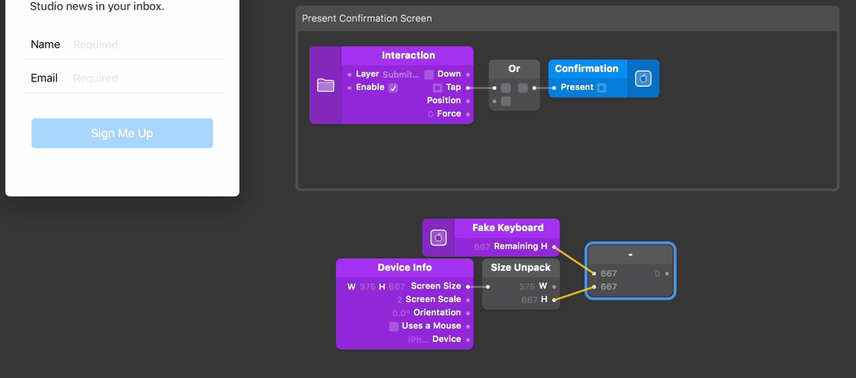
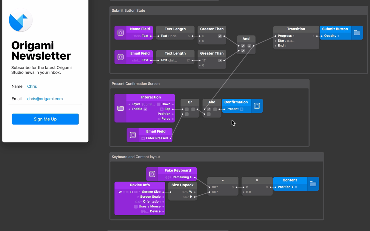
Currently the keyboard overlaps our email field and submit button, so we need to move the content up when it is displayed. To help us do this, the Fake Keyboard component has an output called Remaining H. This tells us how much of the screen height is still visible above the keyboard. If we subtract the device height from this value, we will know how much space the keyboard is taking up and this is how much we want to push up our content by.
Device Info will give us the size of the device we’re using and we’ll use Size Unpack to get the screen height on its own. Add a Device Info patch to the patch editor, then add a Size Unpack patch and connect the Device Info Screen Size output to the Size Unpack input.
Now select the Fake Keyboard layer, click on the Touch button and select the Remaining H output. This will add the Remaining H output to the Patch Editor. Insert a Subtract patch to the patch editor and connect the Remaining H output to the first input on the Subtract patch, next connect the H output from the Size Unpack patch to the second input of the Subtract patch.
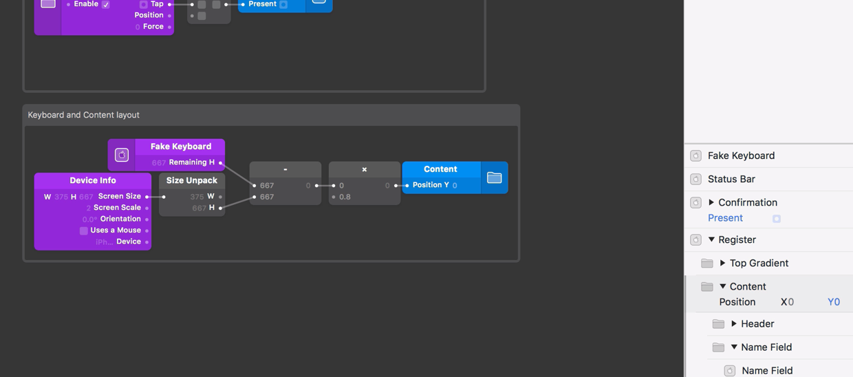
Select the Content group in the Layer List. Find the Y position property input on the layer inspector and click the + next to it, to add it to the patch editor. Connect the output from the Subtract patch to the Y position input on the patch editor.
This looks better, but the content is shifted up a bit too high. Let’s use a Multiplication patch to scale down how much we shift the content up. Add a Multiplication patch, then connect the Subtract patch’s output to the first input on the Multiplication patch and set the second input to 0.8.
Setting the Keyboard type
There are different types of native iOS and Android keyboards, each designed for entering a specific type of information. The Email Text Field will be used to enter email addresses, so let’s set the keyboard type to Email. To do this, select the Email Text Field layer and change the Keyboard Type property to Email in the layer inspector. Now when we edit the Email Text Field, we can see the email keyboard type is displayed with an @ symbol.
Ending text entry
Each Text Field will start editing when we tap on the component in the viewer. We’ll stop editing when we tap on the background. To do this, select the Color Fill layer at the bottom of the Layer List, click on the Touch button and select the Tap interaction. Connect the Tap output on this Interaction patch to the End property on both Text Fields.
Submitting the form
To enter information into the Text Fields, tap one of the Text Fields and start typing with the Mac keyboard.
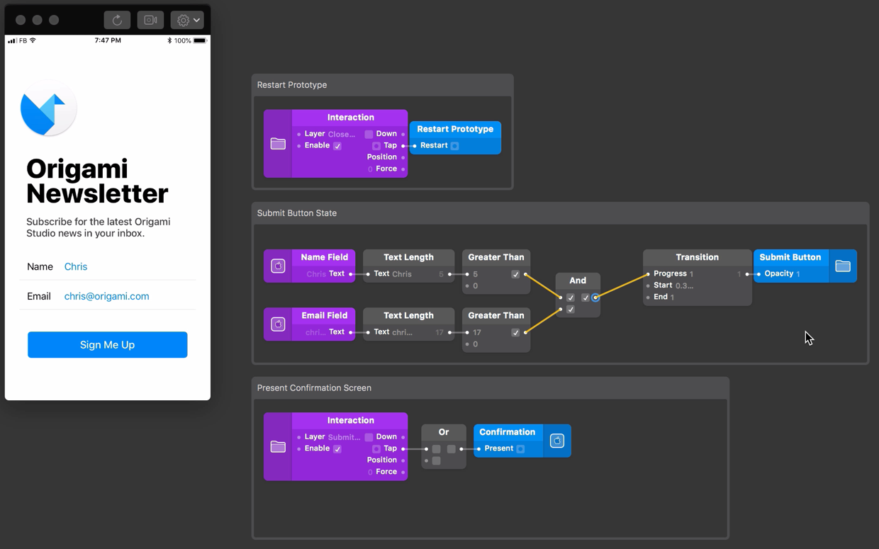
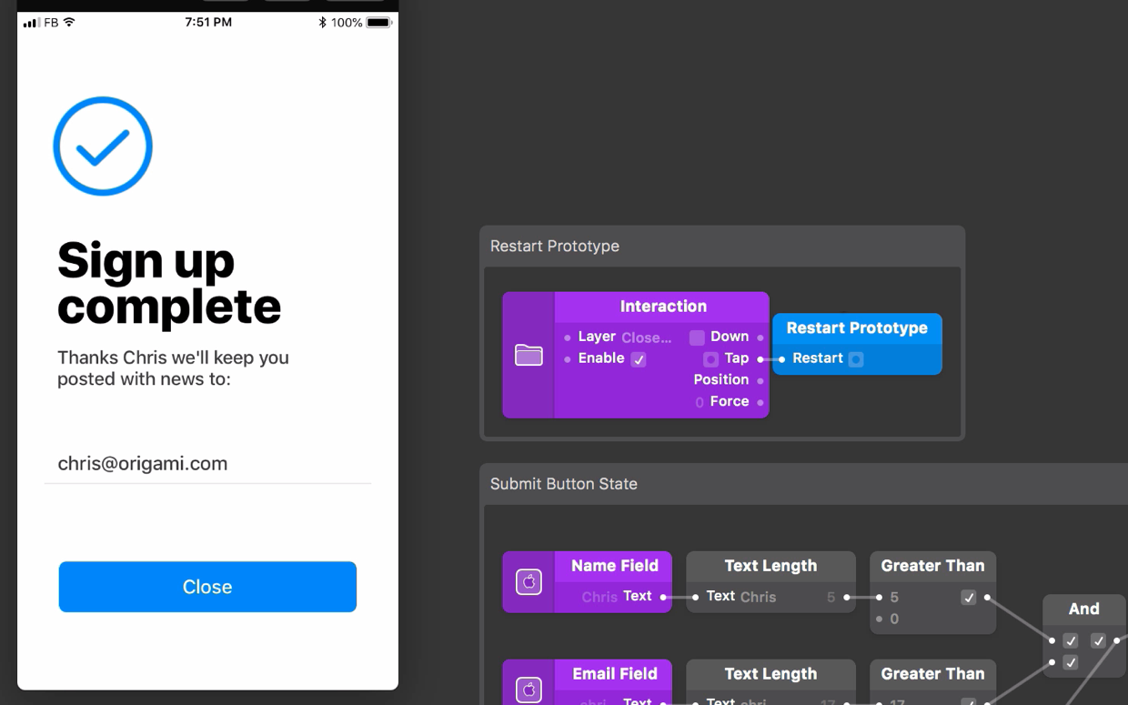
Once we have entered information into both Text Fields, we want to submit the form and present the Confirmation screen. Before we do this, we’ll check to see if information has been entered. In the prototype, we’ll change the appearance of the Submit Button if the information is present and set up a couple of ways to submit the information.
Check if information exists
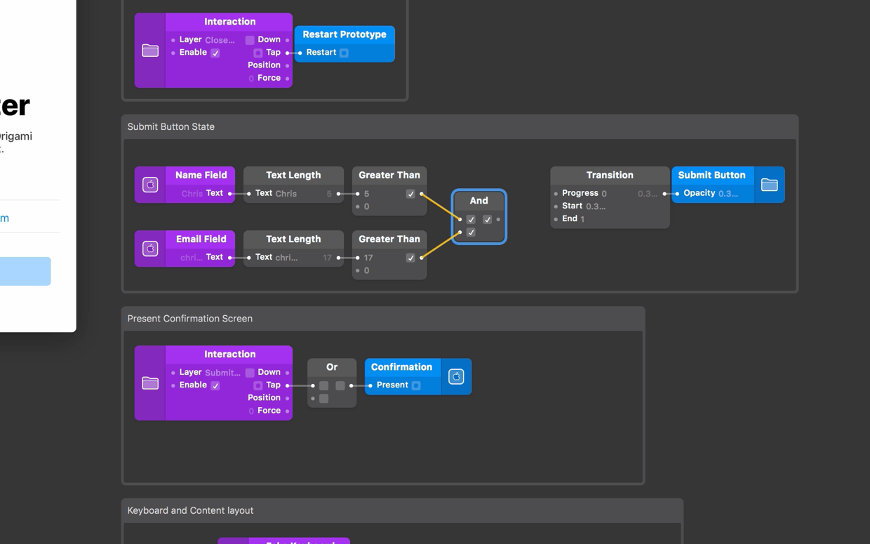
To determine if a Text Field contains text, we can use the Text Length patch alongside a few math and logic patches. We’ll check the length of the text, and if the user has inputted text, we’ll turn on the submit button.
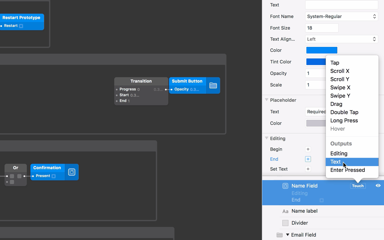
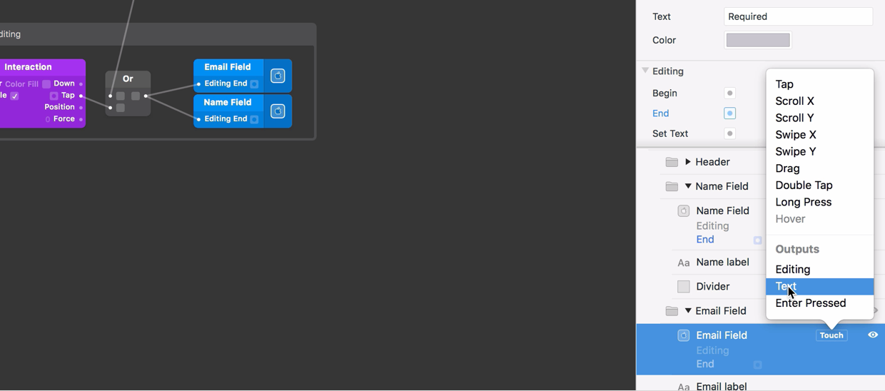
To use the text from a Text Field component, we can use the Text output. Select the Name Text Field, click the Touch button and select the Text output.
To get the length of the text, add a Text Length patch to the Patch Editor and connect the Text output to the input of the Text Length patch. To check if any text is present we want to know if the length is greater than 0, so add a Greater Than patch to the Patch Editor and connect the Text Length output to it’s first input, leaving the second input as 0. The Greater Than patch will be true if the text contains one or more character.
Let’s do the same for our Email Text Field. We can duplicate these two patches by selecting them, holding down the Option key ⌥ and dragging them down the patch editor. Get the Text output from the Email Text Field layer and connect it to the input of the duplicated Text Length patch.
To determine if both Text Fields have text present, insert an And patch and connect the outputs from both of the Greater Than patches to the inputs of the And patch.
Formatting the submit button
We’ll use the And patch to store the state of the submit button. When the And patch output is off, the Submit button should appear to be inactive. When the And patch output is on, the Submit button should be active.
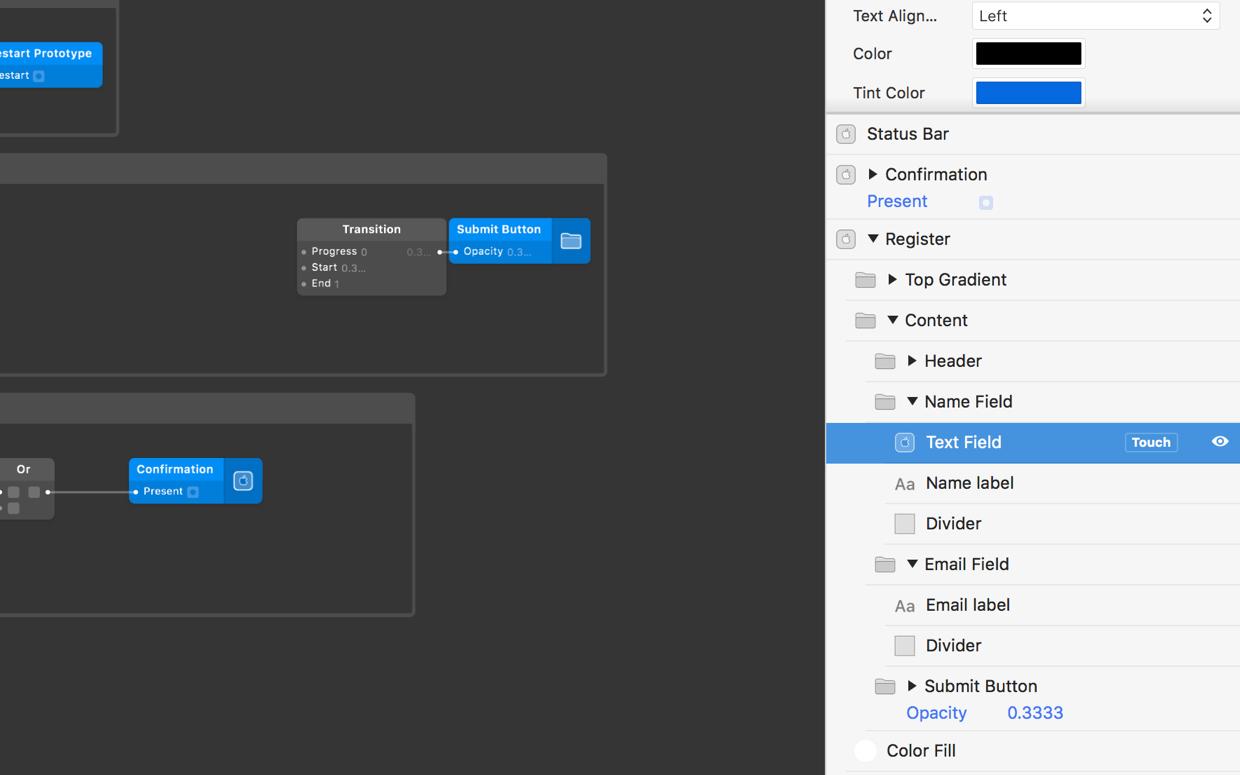
We have already set up a Transition patch to reduce the opacity of the Submit Button group when it is inactive. Connect the output from the And patch to the Transition patch’s Progress input.
Presenting the Confirmation Screen
We’ll present the confirmation screen when either tapping submit or when the Enter key is pressed on the native keyboard, and also when the Text Fields have input.
Tapping the Submit button is already set up to present the Confirmation screen, so let’s set up the Enter key.
Pressing enter on the keyboard to submit
We’re only going check if the Enter key is pressed when editing the Email Text Field, as this is the last field in the form.
Find the Email Text Field, click the Touch button and select the Enter Pressed output.
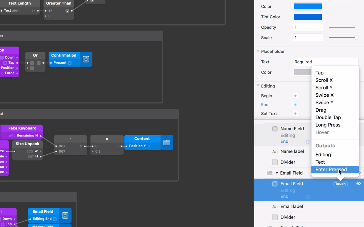
Connect the Enter Pressed output to the second input on the Or patch in front of the Present input on the Confirmation screen.
Submit the form when text is present
To make sure these actions can only submit the form when text is present, insert another And patch to the patch editor. Connect the Or patch and the And patch we used to check both Text Field’s have content to the inputs on the new And patch. Connect the output of the new And patch to the Present input on the Confirmation screen layer.
End editing after submitting the form
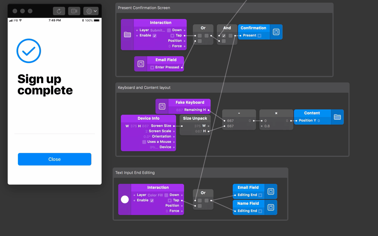
When the form is submitted and the Confirmation screen is presented, we want to end the editing of each Text Field. This will also hide the native keyboard.
We have already connected the Color Fill Interaction patch to the End Editing inputs on each Text Field. To add more inputs that also End Editing, we’ll use an Or patch to connect the form submission steps we just built.
Insert an Or patch to the Patch Editor, connect the Tap output from the Color Fill Interaction patch and output from the And patch, which is connected to the Present input on the Confirmation screen layer, to the inputs on the Or patch.
Finally, connect the Or patch to the End Editing inputs on both Text Fields.
Using the text on the Confirmation screen
Now let’s submit the form and move onto the Confirmation screen. The confirmation screen contains a content group and a close button group. Inside the content group, there is a header group that contains the confirmation text and an email group that contains the email address text.
We previously used the Text output from the Text Fields on the Register screen to determine if any text had been entered. Now we’ll also use the same Text outputs to display Text on the Confirmation screen. We’ll use both the Name text and the Email text to customize the success message.
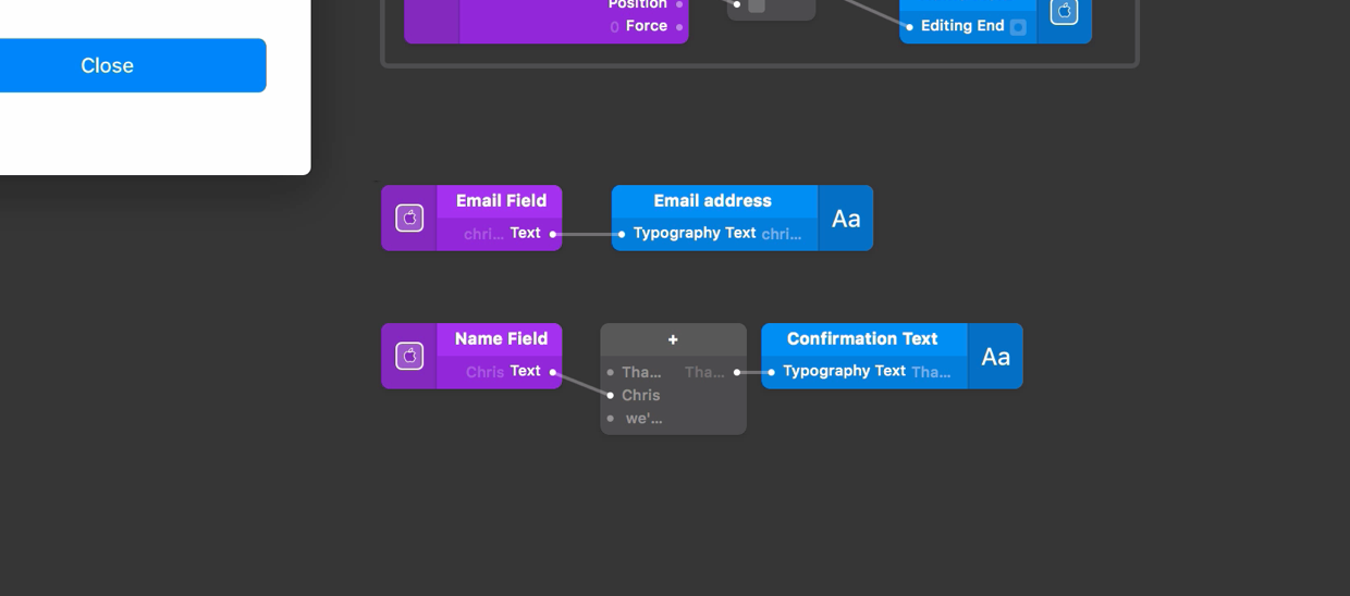
Displaying the email address
We’ll display the email address on the Confirmation screen using the Text output from the Email Component.
Select the Email Text Field, click the Touch button and add the Text output to the Patch Editor. Find the Email Address layer in the Layer List and connect the Text output to the Email Address layer’s Text input property.
Displaying the Name text in our success message
The name text is in the middle of this sentence, so we need to use the Add patch to build a sentence from three different pieces of text.
Insert a Add patch to the Patch Editor. To change the patch type to text, right click on it and inside the Type section, select the Text option. Right click on the Patch and change the number of inputs to 3.
Find the Confirmation Text layer within the Header group on the Confirmation screen and connect the Add patch output to the Text input on the Confirmation Text layer.
Set the first input on the Add patch to part of the sentence before the name text: “Thanks ”. We’ll leave a space at the end so there is a space before a Name that we’ll get from the Text Field.
To add the name to the message, select the Name Text Field layer, click the Touch button and select the Text output. The Text output will represent that Name that the user entered into the Name Text Field. Connect the Text output to the second input on the Add patch.
Finally, set the third input on the Add patch to the end of the sentence: “ we’ll keep you posted with news to:”. This time add a space at the start of the text to give space between the name and this section of text.
Closing the Confirmation screen
After we have read the success message, we can close the Confirmation screen and reset the form by tapping the Close button, which is already connected to the Restart Prototype patch.
Conclusion
That’s it! We can now enter text into our prototype, submit the screen, see a custom success message and repeat as many times as we want!
Export this project to Origami Live, to try the device’s native keyboard. If you haven’t already been through Previewing and Sharing, this tutorial will help you export the prototype to your mobile device.